 |
|
|
Thinking of using merchandise to promote your brand? Planning a campaign to engage with your clients, prospects or potential customers? Once you’ve completed the fun part of finding the perfect promotional items for you, when it comes to your artwork, there are a few key things to think about. Shanon Marais, our in-house Senior Graphic Designer, shares some of her top tips on branding and getting your logo just right for the promotional merchandise you choose to order: |
|
1. Always supply vectored artworkI know you may be thinking ‘what is vectored artwork?!’ Vectored artwork is art that is made up of vector graphics of points, lines, shapes and curves based on mathematical formulas. When you supply us with vectored artwork it basically means that your logo won’t lose its quality when it’s resized for your promotional products, and can be easily done on software such as Adobe Illustrator. Myself and the team are always on hand to help with any queries you may have about this and are able to provide logo designs or a re-draw of your artwork at an extra cost, should you need this. |
|
|
|
2. Try to have no more than two different fontsThis is really important for brand consistency and ensuring the look and feel of your brand is coherent. As a rule, it is best to stick to no more than two different fonts, this allows any supporting text to be easy on the eye and clear. With regards to your logo, the font needs to be simple and clean to work well on the merchandise. |
 |
|
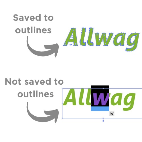
3. Make sure all text is saved to outlinesThis is something that again is easily done in Adobe Illustrator. Saving your text to outlines means that if the person opening your file doesn’t have your fonts installed, they will still be able to use the file. Without converting text to outlines, they could end up being replaced with default fonts that could make your design look completely different. This guide explains the simple process of how to convert your text this way. |
 |
|
|
4. Decide on a cohesive colour paletteAnd specify pantones, again for brand consistency. Your brand’s main colours and fonts should be outlined in your brand guidelines to ensure consistency and help build brand reputation over time. When it comes to branding promotional merchandise, it will be clear which fonts and colours to use on your products. If you don’t have brand guidelines, this is something we can also help you to develop to ensure brand consistency and a great logo on your promotional items. |
 |
|
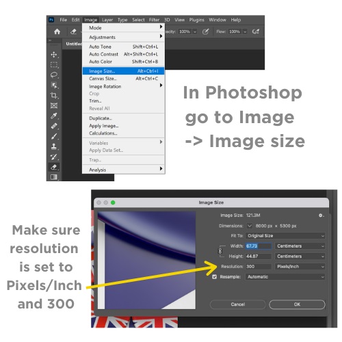
5. Make sure images are supplied in 300dpi
|
 |
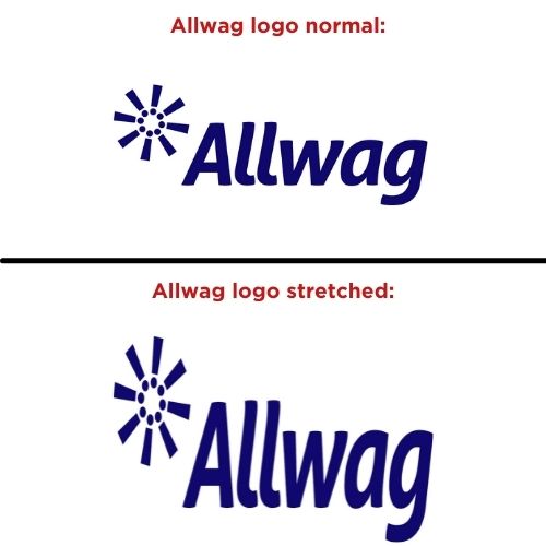 |
6. Lastly.. NEVER stretch or distort a logo to fit a branding areaThe size of your logo is another thing that should be clearly outlined in your brand guidelines, to ensure it is never stretched or distorted, as this will change the face of the logo and make it unrecognisable. If it needs to be a certain size to fit a specific branding area, this can be done on software without distorting the shape of it. |
|
We hope these tips have been helpful for you and your brand, ready for working with promotional merchandise. Our friendly team are always on hand to answer any queries you may have regarding logos and print areas, and our in-house design team will always ensure the integrity of your brand, and are on hand for any creative services needed and supply you with proof artwork to ensure you are 100% happy with it before you order. |
|
 |
|
What is rHIPS.b?
Seen an rHIPS.b product and thought 'what on earth is that?!' Never even heard of it before? We tell you all you need to know about the new sustainable plastic.
Celebrate National Ice Cream Month this July
National Ice Cream month is here! Take a look at what promotional products you could use to get involved.
 |
THIS IS A TOAST |
 |
THIS IS A TOAST |